LONDON
223 Metal Box Factory
30 Great Guildford St
London, SE1 0HS
–
+44 20 8065 5490
[email protected]
223 Metal Box Factory
30 Great Guildford St
London, SE1 0HS
–
+44 20 8065 5490
[email protected]
Latest Insights
Two Trends Driving Cultural Relevance Right Now
If Summer was all about living your best Barbie life, the transition into Fall was all about Taylor Swift and…
Meg Asaro, Head of Strategy, and Sam Wilkes, Creative Director

You Can Sit With Us – How to Snack With Gen Z
Consumer insights, emerging trends, and new snacking behaviors – how snack brands can connect with Gen Z audiences.

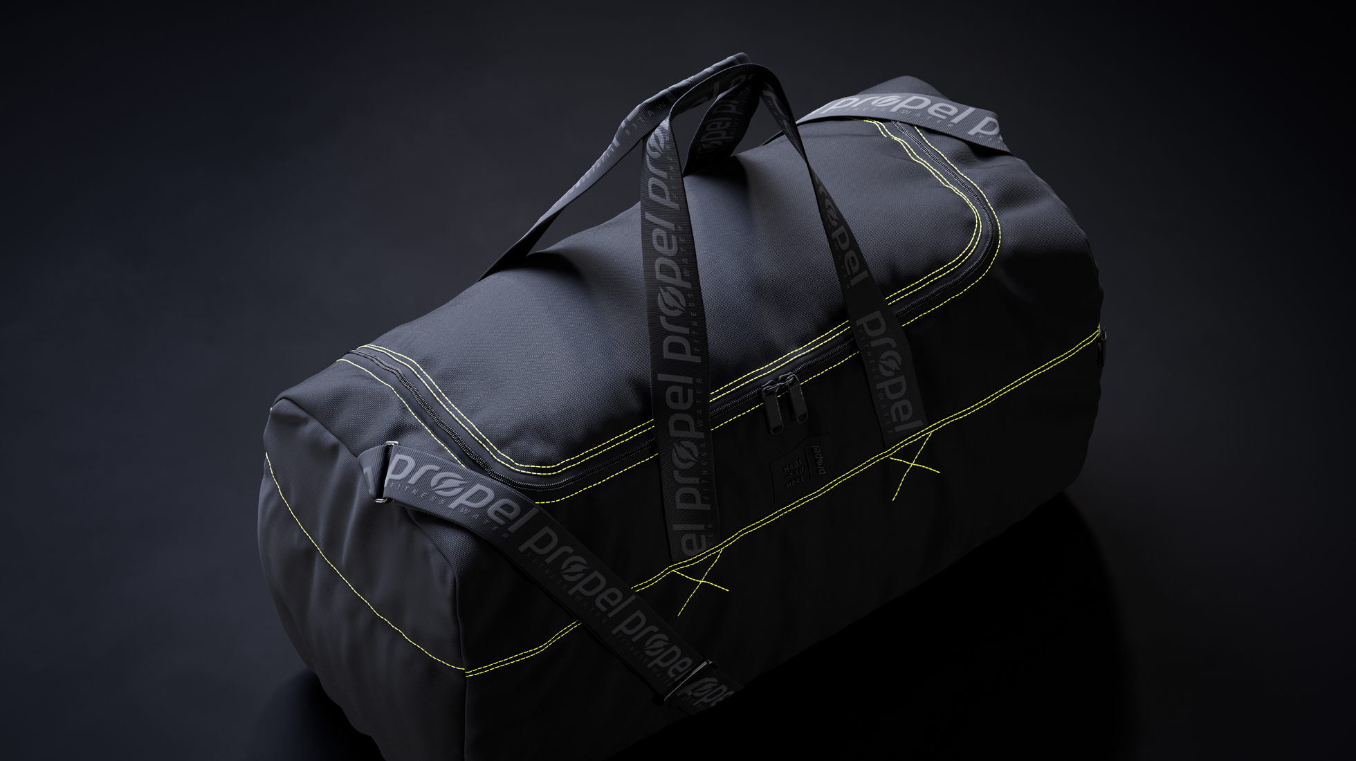
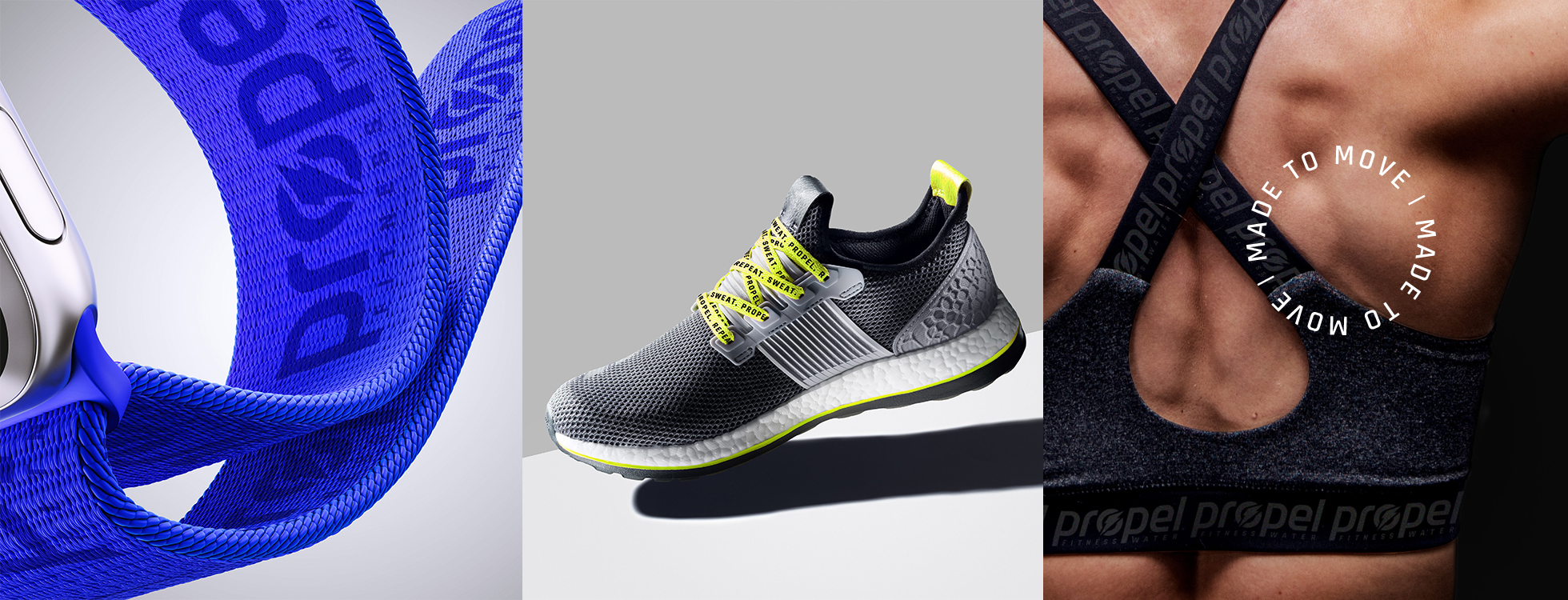
Where Brand Meets Culture: How to Create Sought-After Swag
Seven considerations for developing and designing impactful branded merch that people actually want, use, and care about.
Beth Wheatley, Gali Lucas & Tom Macpherson, Vault49 London

Why Gen Z loves surrealism—and which brands are doing weird right
Think big, dream weird. The latest trend to capture the hearts and minds of Gen Z is surrealism. How can brands jump on board?