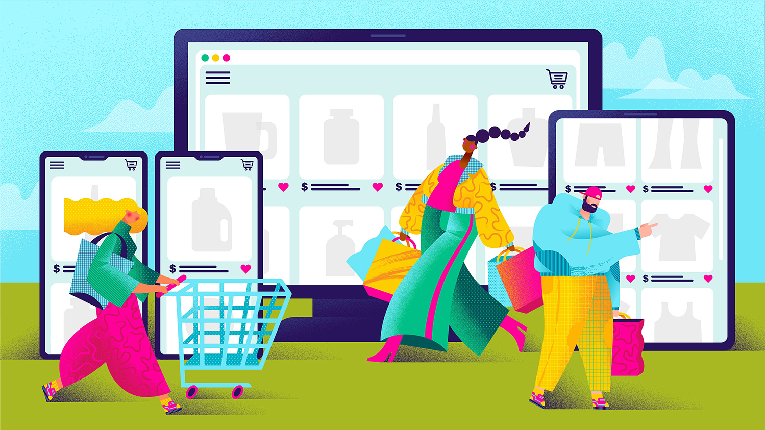
The way we shop has changed dramatically over the past couple of decades. In 2020, online spending represented 21.3% of total retail sales last year, compared with 15.8% the year prior. Whereas we once browsed the aisles of supermarkets in person, baskets swinging in hand, and spent Saturday afternoons in and out of changing rooms on the high street, we now make most of our purchases from the comfort of our own sofa, via websites and apps. Baskets now exist mainly in the top right hand of a screen. A couple of quick clicks and a whole new outfit is delivered straight to your door, along with your entire grocery order, and perhaps, some large, heavy pieces of home gym equipment.
This new retail dynamic inevitably impacts the role of packaging. Design now needs to straddle both the real world and the virtual world, to engage with audiences and stand out on a physical shelf as well as in search results. It’s easy to add a one-liner in an agency brief simply stating ‘design must work on digital and physical platforms,’ but what exactly does this mean?
Here are some ideas of how to maximize your brand’s packaging design and its impact, across both physical and e-commerce spaces.
#1: Identify and treasure your KBAs
When consumers are only seeing your products in a tiny thumbnail square, and quite possibly on a phone, it’s imperative that they be able to recognize your brand immediately. A familiar color, logo or format will ensure that your products will be spotted, recognized, and purchased by those already loyal to your brand.
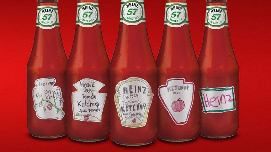
Most brands are aware of what their key brand assets (KBAs) are, but, if not, it’s worth considering conducting research. You could even take a leaf out of Heinz’s book and get your consumers to do the research for you. The iconic condiment brand asked consumers to sketch what their bottles and labels looked like. Chances are, as with Heinz, they’ll remember your KBAs clearly and leave out anything superfluous.
#2: Don’t disregard useful functionality or tactile materials
In the virtual world, devoid of the ability to physically handle the goods in store, consumers navigate by visual only. But this doesn’t mean that the way a product feels in your hand should be disregarded completely. Often the tactility, functionality and beauty of a product in the home are the reasons people repeat the purchase and build a long term, loyal relationship with your brand.
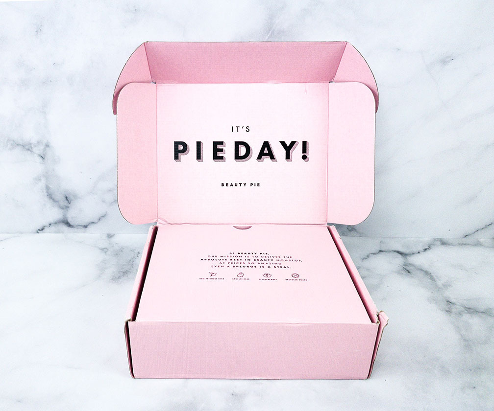
UrbanStems stands out among flower delivery brands – whose packaging, in contrast to its contents, is often plain or uninspiring — thanks to its pretty, eye-catching and cleverly shaped delivery boxes. Similarly, online cosmetics brand Beauty Pie ensures the regular arrival of its (very reasonably priced) products always feels like a special, indulgent birthday treat, with large (highly reusable) pink boxes and the products inside wrapped individually in pink tissue paper.
#3: Zig when others zag
One of the perennial challenges of any retail environment is that of your product standing out in a line-up. In a digital world, the same challenge exists, but decisions are being made even more quickly, sometimes instantaneously, so differentiating yourself from the field is even more important.
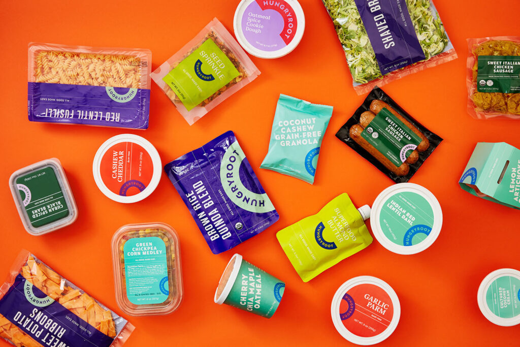
Visually, this can mean employing a new and interesting use of color, font, shape, and other features that aren’t typical of the product category. The bold, cheery purples and reds used by healthy food delivery service Hungryroot, for example, are a far cry from the earthy browns and greens of the palette employed by many other vegan brands.
#4: Make your offer super clear
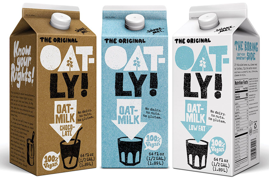
Even if you disrupt the shelf, you still need to take certain cues from the category in order for consumers to feel comfortable with your product and comprehend what they’re actually buying. Oatly does this brilliantly – its cartons emulate those of traditional milk, and the packaging uses the same color codes as other oat milk brands, but its bold, disruptive type and illustrative style set it head and shoulders above an increasingly crowded field.
#5: Consider every detail in depth
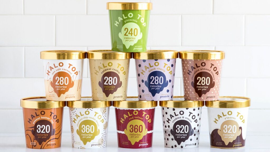
Distill your unique brand promise to the fundamental elements of communication: color, typographic styling, product descriptor. Each core element needs to work at its optimum; there’s no room for anything on the pack that isn’t delivering heavily against your brand promise. You also need to ensure that the most important selling points of your brand are displayed loud and clear. Halo Top light ice cream, for example, announces the fact that it is low in calories in lettering (and numbering) larger even than the branding on the front.
#6: Consider what’s front of pack versus back
While the front can be boiled down to its crucial core elements, that doesn’t mean you need to strip out all those little touches that help engage consumers, such as serving suggestions, romance copy and brand story. Previously an area reserved for mandatories and ingredients only, back of pack is now increasingly used as a space to tell stories to your consumer.
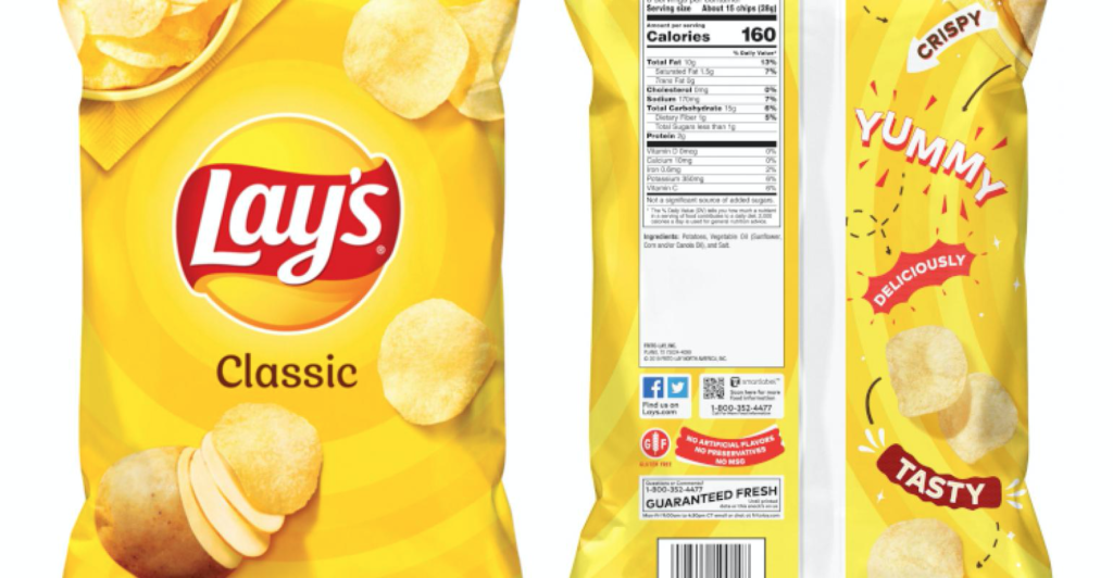
Using the overlooked back-of-the-bag, where the nutrition label lives, Lay’s exploited the unused space to bring more brand personality to its packaging, with added food photography and product buzzwords such as ‘yummy’ and tasty’. See our work for Lay’s here
#7: Try unexpected formats
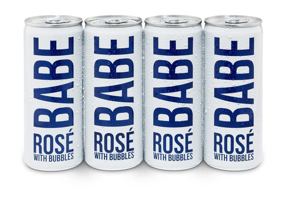
In a sea of sameness, consumers – particularly those shopping online, scrolling through endless identical-looking items — are now more willing to experiment with new formats. Boxed wine, once regarded as the uncouth dregs of the beverage world, has rocketed in popularity in recent years, and shows that old notions of what signifies quality are being rapidly reconsidered. Similarly, boxed mattresses are now the norm. Picnic/travel-friendly canned wine, meanwhile – piggybacking on the popularity of canned, pre-mixed cocktails — now instantly stands out on a crowded shelf, and caters to a different occasion and vibe.
#8: If you have a mission, speak up
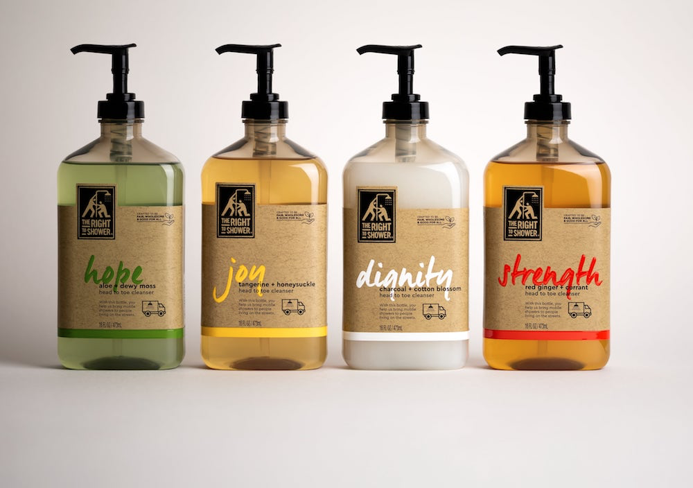
Consumers are increasingly making decisions based on company values. If you’re supporting good causes or bringing about positive social change, don’t be shy about communicating it. Unilever’s social enterprise brand The Right to Shower — which donates 30% of its profits to mobile shower initiatives that support people experiencing homelessness — conveys its mission-driven business prominently on its labels through its product names and iconography. The names — Dignity, Hope, Joy, and Strength — reflect the power of access to a simple shower and the dignity, hope and increased health and wellbeing it brings to hundreds of thousands of homeless Americans. The bottles are also made from 100% recycled plastic.
While there are challenges in standing out in an increasingly virtual retail world, the way we shop now, and the way consumers relate to brands today, also offers opportunities. Accept the challenge to become more creative, innovative, and better at communicating the essence of your brand.