When your brand has spent time, money and creative energy establishing strong equity in its brand assets, the temptation is to protect them at all costs – and rightly so. No brand wants to dilute its impact, confuse its consumers — or worse, undermine its integrity.
But under the right circumstances, brands that have the versatility and confidence to flex their brand assets can unlock powerful new marketing opportunities. If your brand fits the criteria, you can build deeper connections with consumers by creating a dialog through your brand assets.
Flexing your brand assets also gives you much broader scope for creativity. Whether you’re creating a limited-edition product or planning a multi-platform global campaign, it’s harder to create real, lasting impact if only a small amount of the canvas is available to tell the story.
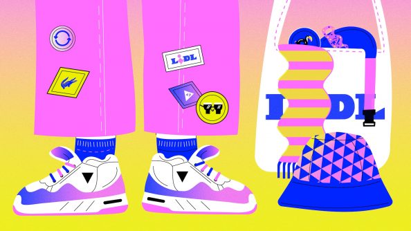
Consider this: on a limited edition pack, those immovable brand assets might include the size and placement of the logo, the design hierarchy, the flavour story, ingredient photography or illustration, and many other elements. It doesn’t leave much space to make a mark.
Using your brand assets as an integral part of the story is a bolder, braver move. The challenge is less pedestrian, and more exciting and rewarding. Rather than simply fighting for space, it becomes about authentically linking the theme at hand to the very heart of your brand.
Connect on a deeper level
When brand assets are used as a starting point for a creative campaign strategy, rather than just tick-boxes on the must-include list, it’s a chance to make your brand an organic part of the story, instead of simply slapping a ready-formed badge on at the end.
With sufficient brand equity built up in a particular asset, there’s scope to be more playful and experimental with its expression in order to engage with a particular event or occasion in a way that keeps your brand fresh and current.
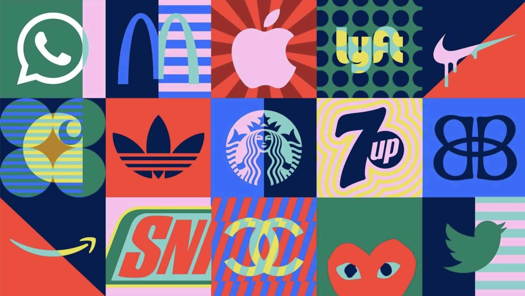
For instance, Johnnie Walker has proved the versatility of its much-loved icon – from its limited-edition ‘White Walker’ tie-in with Game of Thrones, to its creative collaboration with New York-based street artist Tristan Eaton, the ‘walking man’ KBA has become a charismatic lead player in the story in his own right.
Once a KBA is well enough established in consumers’ minds, you can flex other aspects of it while still maintaining strong brand recognition. For instance, the typographic treatment of your brand’s wordmark can be a prominent feature that transcends what it actually says.
Thanks to decades of association, a block of the right bold condensed typeface, slanted at just the right angle and delivered with just the right attitude, can be unmistakably ‘Nike’ even if the Swoosh is absent – unlocking a world of simple, powerful campaign opportunities for the brand.
As part of its long-running ‘You’re Not You When You’re Hungry’ campaign, Snickers also replaced its own bold, condensed oblique wordmark with an extensive range of humorous ‘hunger symptoms’ for consumers to pick from, reminiscent of Coca-Cola’s earlier experiments in large-scale personalisation with its ‘Share a Coke’ campaign.
Protect Sacred Brand Assets
These examples demonstrate the importance of keeping certain elements consistent, however. Some KBAs are more sacred than others and serve as anchors that give the others license to play. Colour is one of the deepest-rooted brand associations: ‘Share a Coke’ would never have worked without the immediate on-shelf recognition of red and white.
For new-to-world brands, of course, there is a different opportunity: building that flexibility into brand equities from the outset, so that consumers recognise and expect it. PepsiCo did exactly that with premium bottled water brand LIFEWTR, for instance: its artistic collaborations became a strong KBA with the versatility to evolve in fresh directions.
Google has experimented with its brand expression for years, to the extent that colour is often the only KBA left. Thanks to its hugely versatile Google Doodles, the tech giant flits between marking landmark historical events and engaging with heavyweight political and social movements to much more light-hearted seasonal celebrations.
Given its constantly evolving and diversifying portfolio, however, Google is also mindful of where experimentation should be dialed back. While it can be effortlessly playful and versatile on its long-established search engine homepage, its KBAs are more clearly defined and protected when launching a new service such as Google TV, for instance.
Owning an individual colour – like Cadbury Purple or Tiffany Blue – is the holy grail for many brands, but Google’s masterstroke was owning a combination of four: that distinctive sequence of blue, red, yellow, blue, green, red unquestionably screams ‘Google’, even if it’s only applied to abstract shapes.
It takes a certain kind of confidence to remove your brand name entirely from a campaign, but it’s a proven tactic for reinforcing a particular KBA in consumers’ minds. Doritos did exactly that in its recent TVC ‘Ad With No Logo,’ letting its distinctive red and blue packs and iconic triangular shape do the heavy lifting.
Unlock your brand personality
The most common way for brands to express their personality and connect with new audiences is through campaigns and activations where the KBAs are kept sacred, and the brand flexes in other areas. This can be very effective. But the opportunities to tell brand stories across diverse platforms are constantly growing, and it could be time to consider evolving your KBAs in tandem to ensure they work as hard as they can.
Flexing your KBAs to tell those stories can also transcend languages and cultures. McDonald’s pushed this theory to the limit in Puerto Rico recently when it dropped its logo and expressed figurehead products such as the Big Mac and Happy Meal as heavily blurred, stylised shapes alone, with the line: ‘Say no more.’ It’s a testament to how the look and feel of a product can be a powerful KBA in its own right.
Your KBAs can be the spark of your brand personality – a starting point for creative experimentation, not just the endorsement stamped on at the end. Dunkin’ Donuts’ recent rebrand demonstrated how effective that can be in practice, translating the brand’s distinctive use of colour, type and tone of voice seamlessly across all the key visuals, ensuring every ingredient works hard at every touchpoint.
By being smarter and more dynamic with your KBAs, you’ll unlock a broader creative canvas, tell more authentic stories, and ultimately build stronger consumer relationships as a result. You just need the confidence to loosen some of those constraints and let them breathe.
anna
John Glasgow, Co-founder & Partner
LINKED IN